IMMAGINARE IL TESTO
IL POTENZIALE DI PAROLE INESPRESSE
Giorgio Milani incontra in studio Matteo Galbiati
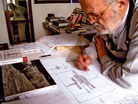
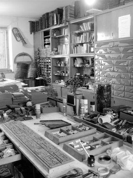
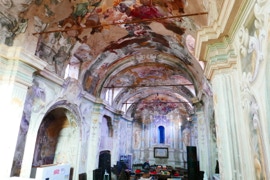
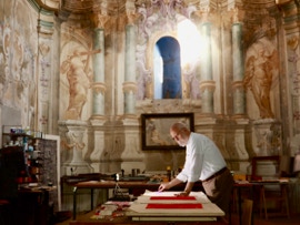
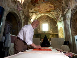
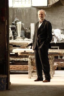
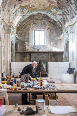
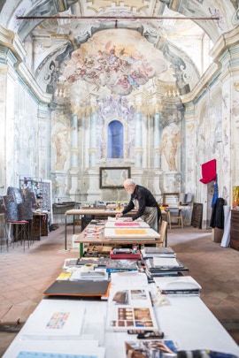
Giorgio Milani mi accoglie con garbo e gentilezza, con la premura propria dell’ospite che tiene, timidamente, a svelare l’universo celato dietro il portone di quella che, un tempo, è stata una chiesa e che oggi accoglie il suo studio. Entriamo insieme ed è subito incanto: l’ampiezza e l’apertura degli spazi, la bellezza del decoro ad affresco, le ferite e le cicatrici inferte dal tempo che, usurando l’edificio, ne accentuano la magnificenza sono tutti elementi che si sovrappongono, in un dialogo impensabile, alle opere finite, a quelle in corso di realizzazione e ai progetti ancora in fase di ripensamento a costituire una suggestione che predispone già lo sguardo nel leggere oltre le cose tangibili. Lettere, attrezzi, colori, forme, volumi e immagini, tutto dialoga in un equilibrio preciso che sa quasi presentarsi come esito di una misteriosa alchimia. Irripetibile altrove.
È un luogo magico e si percepisce subito, è di quelli che proprio non ti aspetti perché, pur in decadenza (la chiesa non è più in uso e solo la presenza dell’artista ne ha salvaguardato la bellezza interrompendo il decorrere ingiurioso degli anni), sembra tutto esattamente al suo posto, rispondente ad un ordine ed un equilibrio superiori che chiariscono e stimolano, nel suo complesso insieme, la grandiosità della immaginazione che qui muove l’agire del pensiero e l’intuizione del fare.
Penso subito che questo luogo sia un perfetto incubatore di idee e che, in un certo senso, Milani riesca, col suo lavoro fatto di alfabeti e lettere, a catalizzare qui tutto il non detto rimasto in sospeso nell’aria, attorno a noi, dentro i nostri sguardi, nella mente degli uomini che trova, invece, una sempre così felice manifestazione nelle sue opere.
Sono colpito, ma lui, quasi a giustificare tanta bellezza e a mitigarne l’orgoglio, mi dice che non è il solo studio in cui lavora ne ha altri a poca distanza... Poco importa come sono gli altri, qui so – si sente – che si respira il tempo e la meditazione, qui nasce l’anima di ogni pensiero che si traduce nelle sue opere.
Questo grande ambiente, denso di lavori e testimonianze ci assorbe e la nostra conversazione avviene non stando seduti a un tavolo o comodamente abbandonati nella morbidezza avvolgente di qualche poltrona, ma il nostro raccontarsi reciproco si muove instancabile seguendo il nostro vagare tra le opere, standoci in mezzo, attorno, in un felice incrocio semantico di riflessioni e considerazioni che il valore della conoscenza, la sensibilità, l’esperienza e la dedizione dell’artista sanno sempre guidare.
[Il nostro dialogo inizia con una lunga conversazione sulle reciproche conoscenze, scoprendo legami invisibili che sorprendono per l’apparentamento che porta percorsi diversi a potersi incrociare e incontrare. Commentiamo anche la spiacevole notizia della scomparsa di Philippe Daverio che, mancato proprio pochi giorni prima del nostro incontro, è stato uno tra i più attenti e appassionati lettori dell’opera di Milani.]
Come è iniziata la tua ricerca artistica?
Fino agli anni Ottanta, oltre alla pittura, ho lavorato nell’ambito della grafica, della comunicazione e della pubblicità, prima in uno studio grafico fondato con un amico poi diventato agenzia che, nel tempo, ha avuto un certo successo anche in ambito internazionale.
La mia doppia attività ha sempre alimentato, vivacizzato e contaminato il mio pensiero di creativo. In ogni caso il contesto lavorativo aveva indotto in me già una predisposizione per il rapporto immagine-parola. Incontrati i caratteri tipografici e percepito il loro potenziale espressivo, questi hanno definitivamente cambiato l’orientamento del mio percorso.
Come è avvenuto questo incontro con i caratteri tipografici che sono diventati la cellula fondante della tua ricerca?
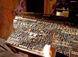
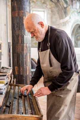
Per lavoro mi capitava spesso di venire in contatto con le tipografie dove vedevo questi caratteri mobili che, piano piano, venivano dismessi per l’aggiornamento della tecnologia di stampa e che suscitavano in me una certa attrattiva, un fascino misterioso. Un amico un giorno mi ha segnalato che c’era un camion intero di questi elementi che sarebbero finiti in discarica, mi dispiaceva lasciare che un patrimonio di questo genere potesse essere perduto per sempre, così li ho presi tutti anche se non sapevo esattamente cosa ci avrei fatto. Li ho immagazzinati è sono rimasto in attesa. È stata una gestazione lenta, lunga qualche anno, ma poi hanno iniziato a comporsi le prime opere. A quel punto è stato come scoprire un mondo nuovo.
Parli di un patrimonio da salvaguardare... Che valore hanno in generale questi materiali e per te in particolare?
I caratteri mobili per la stampa hanno rappresentato una svolta per la diffusione del nostro sapere. Johannes Gutenberg, con la sua Bibbia del 1453 – primo volume a stampa in Occidente – ha permesso, grazie a tale sua invenzione, un allargamento della conoscenza per la maggior diffusione dei libri. La parola stampata ha iniziato ad invadere la nostra quotidianità, ha favorito la diffusione e la circolazione di sapere mutando il nostro modo di comunicare e relazionarci, di apprendere e conoscere, di narrare e conservare memorie.
Ogni singolo carattere per me diventa un’infinita gamma di parole potenziali; è un frammento di qualcosa che può compiersi anche senza una conformazione verbale, lessicale o didattica. È qualcosa di immediatamente riconoscibile e che tutti conoscono, identificano e comprendono in quanto “lettere”. L’alfabeto ho sempre pensato essere la più determinante tra le invenzioni dell’uomo e l’invenzione dei caratteri mobili la più importante del millennio passato.
[Toccando alcuni di questi caratteri tenuti in ordinati cassetti (altri sono raggruppati in scatole e molti sono disseminati sui tavoli di lavori, tra libri, riviste, appunti e progetti) ne parla rigirandoli nella mano e osservandoli con premurosa gentilezza, direi quasi con affetto se non rischiasse, come affermazione, di apparire troppo romantica nel senso più superficiale e retorico. Mi mostra il segno e le tracce di inchiostro, illustrandomi le peculiarità di ogni diverso elemento con una cura che lascia ben intendere quanto questi “oggetti” non siano solo una base tecnica per creare l’opera, ma proprio elementi di attenzione sensibile che celano non solo l’universo dell’immaginazione dell’artista, ma anche tutta la storia che conservano e quanto hanno scritto e quanto potrebbero ancora scrivere]
Il mondo che vedi e che leggi lo vedi sempre alla rovescia però...
È vero, questi caratteri nascono per essere impressi su un foglio e solo allora danno senso alla giusta lettura per cui sono stati concepiti. Ormai io mi sono abituato e la mia visione si è assuefatta nel manipolarli in questo modo... Credo che non sarei in grado di leggerli diversamente.
La mole e la quantità di materiali che hai nello studio è davvero considerevole dove la recuperi?
Quando è iniziato il mio lavoro con questi materiali e, poco a poco, ha acquisito la configurazione attuale instradandosi nell’alveo delle ricerche e delle praticate dalla Poesia Visiva, mi sono reso conto di doverli recuperare. Ho iniziato a cercarli nelle tipografie che, nel corso degli anni, andavano chiudendo o magari dovevano “liquidare” questi elementi divenuti obsoleti.
Oggi si pone il problema che, in fondo, a un certo punto non si potranno avere semplicemente perché non ci saranno più. Penso al mio lavoro come costretto a una certa “scadenza” che gli impone una costante revisione linguistica.
In questo senso come ti poni nei confronti della tecnica? Non ci sono solo collage di caratteri?
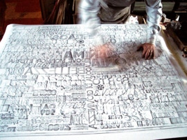
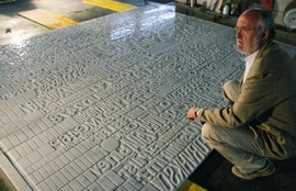
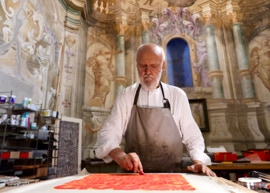
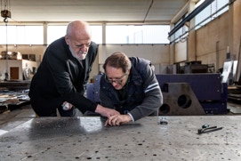
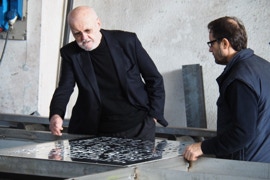
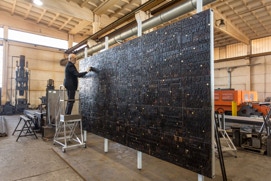
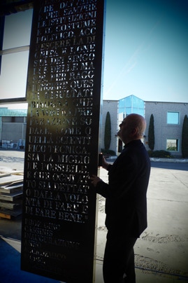
Ovviamente tutto sopraggiunge con il tempo. Dopo le prime composizioni ho capito che avrei potuto esplorare altre situazioni senza snaturare il nucleo originante la mia poetica. Ho iniziato a sperimentare scoprendo di amare il cambio dei materiali e della tecnica. Questi aiutano sempre a mutare l’approccio, a stimolare e individuare nuove soluzioni, magari anche impensabili. Quando ho iniziato a lavorare il marmo sono arrivato a sperimentare una tecnica diversa imprimendo le lettere con una sabbiatrice; nella ristrutturazione del Campiello di Vigonovo in provincia di Venezia le lastre di Corten lavorate a laser hanno permesso alle parole di rivestire l’intera facciata dell’edificio.
Ho realizzato opere in acciaio, in marmo, in bronzo, in cemento e in vetro, ci sono anche diversi frottage, su carta e su tela, che eseguo su composizioni di lettere e dipinti a olio (il richiamo della trementina è per me irresistibile!). Sono anche giunto, ma è stato il lavoro stesso a guidarmi, a intervenire, come accennavo, con opere ambientali e pubbliche su scala monumentale.
Con quali galleristi hai lavorato?
È stato determinante l’incontro con Gianfranco Bellora, il celebre gallerista milanese che si è sempre occupato di PoesiaVisiva e che ho conosciuto nei primi anni Ottanta. Gianfranco volle che fossi io a esporre per ultimo nella sua galleria di via Borgonuovo a Milano.Successivamente ho avuto un proficuo e stretto rapporto prima con Franco Rossi (e poi con la figlia Erika) della Galleria 2000&Novecento di Reggio Emilia, il quale ha realizzato diverse mostre sul mio lavoro con i caratteri tipografici in Europa e Stati Uniti.
Quanto ha influito il rapporto con la Poesia Visiva?
Un legame evidente esiste, non posso negarlo. Anche io mi sento, per ovvie ragioni, vicino allo sguardo di quegli autori che, prima di me, hanno percorso i sentieri di questo tipo di ricerche ed espressività e ne sono quasi figlio. Per me si è posto subito il problema di dover arrivare dopo, tipico di chi si presenta quando tutto è già stato fatto. Emilio Isgrò, Lamberto Pignotti, Vincenzo Accame, Ugo Carrega, Magdalo Mussio, Gastone Novelli e tutti gli altri avevano già esplorato tutto quando io ho iniziato.
La svolta avvenne con i Poetari, sono queste opere ad aver segnato la mia storia: era dalla fine degli anni ’80 che lavoravo con i caratteri tipografici, ma la prima occasione ufficiali per esporli fu, nel 1997, la mostra intitolata Poetari di fine Gutenberg curata da Tommaso Trini alla Fondazione delle Stelline di Milano. Fu poi un’osservazione di Luciano Caramel che mi persuase definitivamente sull’impegno altro che dava la mia riflessione artistica in questo ambito: fu lui che, legandomi alla storia della Poesia Visiva, intuì per primo il peso e il valore dell’oggetto costituente (i caratteri) quale motore di un senso diverso. Fu lui a parlare della mia ricerca come “Poesia Visiva oggettuale”.
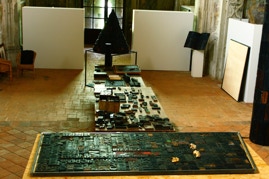
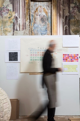
La grande mostra, che stai preparando per Piacenza, viene accolta in una chiesa: un ambiente che riporta al tuo studio, una sorta di ritorno a casa per i tuoi lavori. Come hai organizzato il percorso espositivo?
Tengo davvero molto a questa mostra che riassume gli ultimi dieci anni della mia ricerca e le diverse famiglie o tipologie di opere su cui ho lavorato. Ho pensato ad una suddivisione per aree tipologiche dove raggruppo i 120 lavori che ho scelto tra i più significativi da me realizzati tra cui i Poetari, le Babeli, Oriente/Occidente, le Sindoni, le Sublimazioni, le Torri, i Libri e le Rose.
L’ampiezza dello spazio e la possibilità di guardare senza un orientamento fisso e predisposto, senza una gerarchia metodologica, cronologica o temporale, aiuta e stimola il visitatore ad attraversare la mia esperienza scegliendo un libero percorso propositivo, capace di individuare quelle connessioni e quelle reciprocità che, recepite dall’esperienza, maturano nella coscienza di ciascuno.
Come reagisce il pubblico davanti alle tue opere?
Ricorro al pensiero di Umberto Eco che, nel suo preziosissimo testo Opera aperta, asseriva quanto oggi nell’importanza e nella centralità del suo senso l’opera d’arte sia un aleatorio farsi capace sempre di un continuo rinnovamento.
Mi piace pensare ai miei lavori come delle opere aperte che permettono letture differenti da parte di chi le guarda in base alla propria cultura e sensibilità. Molti colgono il fascino mosso dagli alfabeti, dalle lettere, dai caratteri, catalizzatori di sapere e conoscenza traducibili nell’impegno di memorie indefinibili. Ciò permette ai lavori di portare con sé anche atteggiamenti molto diversi tra loro.
Dove si trova, in via definitiva, il “testo”?
Solitamente si adatta alla situazione, ma la verità è altra: il testo va sempre immaginato.
Borgonovo Val Tidone, 4 settembre 2020
IMAGINING THE TEXT
THE POTENTIAL FOR WORDS UNSAID
Giorgio Milani meets Matteo Galbiati in studio
Giorgio Milani welcomes me with grace and kindness, with the care of a host who shyly wishes to reveal the universe hidden behind the door of what was once a church, and which today accommodates his study.We enter together and immediately it is enchanting: the breadth and openness of the space, the beauty of the fresco decorations, the wounds and scars inflicted by time, which, in distressing the building, accentuate its magnificence; all elements that overlap in an inconceivable dialogue with the finished pieces, those in progress and projects still under consideration, evoking a feeling that readies the gaze to interpret beyond what is tangible. Letters, tools, colors, shapes, volumes and images, everything interacts in a precise balance that almost presents itself as the result of a mysterious alchemy. Not reproducible elsewhere.
It is a magical place, which you perceive immediately, the kind that you simply do not expect because, despite its decay (the church is no longer used and only the artist’s presence has safeguarded its beauty by interrupting the ravaging effects of time), everything appears exactly in its place, responding to a higher order and equilibrium that clarifies and stimulates as a complex whole, the imagination’s grandeur, which here drives the mind’s action and the intuition of making.
I immediately think this place must be a perfect incubator of ideas and that, in a way, Milani succeeds with his pieces made of alphabets and letters, to catalyze in this place all that remains unsaid in the air, around us, in our glances, in the minds of men, which otherwise always attains such joyful manifestation through his work.
I’m impressed, but as if to rationalize so much beauty and lessen its lushness, he advises this is not the only studio he works in, there are others close by... No matter what the others are like, here I know–one feels–that one inhales time and meditation, here the soul of every thought that translates into his work is born.
This great space filled with pieces and mementos envelops us, and our conversation takes place not seated at a table or comfortably abandoned in the embracing softness of an armchair; our mutual storytelling moves tirelessly, following our wanderings amongst the work, standing at its center, around it, at a happy semantic crossroads of thoughts and considerations, which the artist’s value of knowledge, sensitivity, experience and dedication, always knows how to conduct.
[Our dialog starts with a long conversation about our mutual acquaintances, discovering surprising and invisible bonds due to alliances that lead different paths to intersect and meet.We also discuss the sad news of Philippe Daverio’s passing, just a few days earlier, who was one of the most attentive and passionate interpreters of Milani’s work.]
How did your artistic research begin?
Until the 1980s, in addition to painting, I worked in graphic design, communication and advertising, initially in a graphic design studio I founded with a friend that later turned into an agency, which over time garnered international success.
My dual work has always fueled, energized and influenced my creative thinking. In any case, the work environment had already sparked in me a predisposition for the image-word relationship. Having encountered the typefaces and perceived their expressive potential, they definitely recalibrated the course of my journey.
How did this encounter with the typefaces, which have become the cellular foundation of your research, take place?
Through work, I often came into contact with printers where I saw these typesetting characters that gradually were phased out with the upgrade of printing technology, and towards which I felt a certain attraction, a mysterious pull. One day a friend noted there was a truck full of these items that were destined for landfill, I felt bad allowing such valuable stock to be lost forever, so I took it all, even if I wasn’t exactly sure what I was going to do with it. I put it into storage and waited. It was a slow process, a few years in the making, but then the first pieces came to fruition. At which point it was like discovering a new world.
You talk about a heritage to be safeguarded... Generally speaking, what value do these materials have, and for you specifically?
Typesetting characters symbolize a turning point for the dissemination of our knowledge. Johannes Gutenberg, with his 1453 Bible–the first printed volume in the West–has, thanks to his invention, enabled the broadening of knowledge through a greater distribution of books.The printed word began taking over our daily lives, fostering the distribution and circulation of knowledge by changing the way we communicate and interact, learn and gain knowledge, narrate and preserve memories. For me every single type turns into an infinite range of potential words; it is a fragment of something that can be achieved even without a verbal, lexical or didactic structure. It is something that is instantly recognizable and that everyone knows, identifies and understands as “letters”. I always thought the alphabet was among the most significant human inventions and the invention of typesetting characters, the most important in the past millennium.
[Touching some of the type stored in organized drawers (others are grouped in boxes and many lie scattered on tables of work among books, magazines, notes and projects), he mentions them while twiddling and looking at them in his hand with thoughtful kindness, I would almost say with affection, if such a statement weren’t at risk of appearing overly romantic in the most superficial and rhetorical way. He indicates the signs and traces of ink and describes the peculiarities of each individual element with a degree of care that shows how these “objects” are not merely a technical foundation for creating his work, but actual elements of sensitive attention that conceal not just the universe of the artist’s imagination, but also the entire history they preserve, what they wrote and what they could still write.]
The world you see and interpret; you always see it upside down though...
That is true, type is created to be imprinted on a sheet of paper and only then provide meaning to the correct reading for which they were conceived. By now I am used to it and my vision has become accustomed to handling them this way... I don’t think I could see them any differently.
Is the number and volume of materials in your study is really considerable, where do you get it from?
When I commenced working with this material and, bit by bit, it acquired the current configuration by routing itself into the hive of research and the practice of Visual Poetry, I realized that I had to hold on to it. I started looking for it at the printers, who over the years, were closing down or maybe had to “liquidate” these items as they became obsolete.
Nowadays a fundamental question arises, which is, at some point they will no longer be available simply because they will no longer exist. I think of my work as being forced by a certain “deadline”, which demands ongoing linguistic review.
In this respect, what is your approach to technique? Are they merely collages of type?
Obviously everything comes with time. After the first compositions, I realized that I could explore other situations without distorting the core that originated my poetry. I began to experiment, discovering that I loved alternating materials and techniques. These always assist in changing one’s approach, stimulating and identifying new solutions, perhaps even unimaginable ones. When I began working with marble, I came to experiment a different technique by imprinting the letters with a sandblaster; during the Campiello di Vigonovo renovation, in the province of Venice, the laser-cut weathering steel screens enabled the words to cover the facade of the entire building. I have worked with steel, marble, bronze, concrete and glass, I also have several frottage on paper and canvas, which I execute on compositions of letters and oil paintings (I find the call of turpentine irresistible!) I also began, though it was the work that guided me, to work as I mentioned before, with environmental and public pieces on a monumental scale.
What gallerists have you worked with?
Meeting Gianfranco Bellora was crucial, the famous Milanese gallerist who has always worked withVisual Poetry and whom I have known since the early 1980s. Gianfranco wanted me to be the last to exhibit in his gallery in Via Borgonuovo in Milan. As a result, I enjoyed a close and profitable relationship with Franco Rossi (and later his daughter Erika) from Galleria 2000&Novecento in Reggio Emilia, who arranged several exhibitions of my work with typefaces, in Europe and the United States.
How much has the relationship withVisual Poetry influenced you?
There is a clear link, I cannot deny it. For obvious reasons, I also feel close to those authors’ gazes who before me followed the same path of research and expression, and I’m almost their offspring. I was immediately faced with the challenge, typical of those who of arrive after everything has already been made. Emilio Isgrò, Lamberto Pignotti, Vincenzo Accame, Ugo Carrega, Magdalo Mussio, Gastone Novelli and all the others, had already explored everything when I started.
The turning point came with the Poetari, these pieces have marked my history: I had been working with typefaces since the late 1980s, but the first official chance to exhibit them was in 1997, in the show entitled Poetari Di Fine Gutenberg, curated by Tommaso Trini at the Fondazione Stelline in Milan. Later, a comment by Luciano Caramel ultimately convinced me of the other commitment that my artistic thinking provided in this area:it was he who, by connecting me with the history ofVisual Poetry, first understood the weight and value of the constituting object (the type) as the engine for a different direction. He spoke of my research as “Objective Visual Poetry”.
The large exhibition that you are setting up in Piacenza is held in a church: an environment reminiscent of your studio, a kind homecoming for your work. How did you arrange the exhibition?
I really care a lot about this exhibition, which sums up the past ten years of my research and the different families or kinds of pieces I’ve worked on. I thought of a subdivision into typological areas, in which I gather the 120 pieces I selected among my most significant work, including the Poetari, the Babeli, Oriente/Occidente, the Sindoni, the Sublimazioni, the Torri, the Libri and the Rose.
The vastness of the space and the ability to look without a fixed, prearranged order, without a methodological, chronological or temporal hierarchy, helps and encourages the visitor to traverse my experience choosing an unrestricted, purposeful path, capable of identifying the connections and exchanges that are understood by experience and that ripen in everyone’s consciousness.
How does the audience react to your work?
I turn to Umberto Eco’s thinking, who in his most valuable writing Opera Aperta, stated how nowadays the work of art, in the importance and centrality of its meaning, is a random being always capable of continuous renewal.
I like to think of my pieces as open-ended works that permit different interpretations by those who look at them, based on their culture and sensitivity. Many grasp the fascination coming from the alphabets, the letters, the type, catalysts of knowledge and understanding, translatable into the workings of unfathomable memories. This also enables the work to carry within it very contrasting attitudes.
Where is “text” ultimately placed?
Usually it adapts to the situation, but the truth is elsewhere: the text must always be imagined.
Borgonovo Val Tidone, 4 September 2020